
The conception of an entirely new product and brand, plus a relaunch, all within a year and a half.
Background Imagine building a brand identity from the ground up, then reconceptualizing it less than a year later…
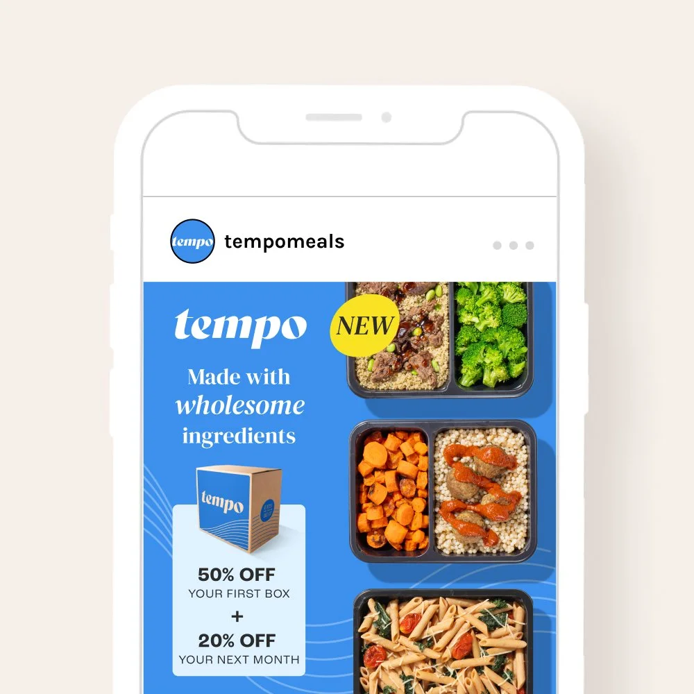
In September of 2023, Home Chef launched a new sub-brand, Tempo by Home Chef, a healthier, single-serve microwavable meal delivery service, to compete in the ready-to-heat space. My team was tasked with the entire brand conception and execution. After a soft launch with very soft results, we went back to the drawing board to rethink our key messaging and overall brand story.
TeamCreative Direction: Nicole Timmerman, Katie Bolt
Design: Emily Bass, Serena Moy, Karrah Toby, Nicole Timmerman
Photo + Video: Julie Young, Skalawag Productions, Jason Richardson
Copy: David Anthony, Shannon Nolan
Brand Consultant: Manny Fernandez
Concepting
Target audienceBusy people living an active lifestyle. While Home Chef’s core menu tends to be mostly female over the age of 45, the new brand aims for a 50/50 split between genders under 45.
CompetitorsFreshly (no longer in business)
Factor
Cook Unity
Trifecta
Brand keywordsApproachable
Inspring
Youthful


Concept chosen by Home Chef Brand team.

Launch
Brand guidelines • Packaging • Emails • Landing pages • Paid media • Video • Direct mail 


The launch was met with sub-par returns, including CPAs in the $900 range when our benchmarks were around $200.
High CPAs combined with high numbers of paused and cancelled accounts, and inconsistent meal reviews meant we knew we needed to optimize and evolve the product and brand. A new keyword was also tossed into the mix by leadership: premium. How do we better show the product’s quality to therefore justify a higher price point?
With quality and health now at the forefront of our marketing strategy, the team looked to gain an outside perspective on how well our brand represented this new direction, and what changes we could make to better align with the new brand trajectory. To do so, we hired an external consultant to work alongside our in-house team.
Along with brand updates, other teams continued to evolve the product to improve things like meal taste, health claims, funnel experience, and fulfillment issues for a refresh customer experience.

We made tweaks to the color palette by deepening and enriching the hues, and limiting the number of colors in the palette.

We decided to switch Roc Grotesk to Aktiv Grotesk. Roc’s uniqueness gave it a more novel appearance, and felt limiting in use.

