Team
Design: Serena Moy, Emily Bass, Celia Bizien, Karrah Toby, Nicole Timmerman
Copy: Michelle Castro
Photo + Video: Mike Matthews
Brainstorm
The Creative team began by doing competitive research and gathering inspiration for a new brand look and feel. Though the Brand team had mentioned that it was preferable if the logo stayed the same or changed minimally, the team wanted to explore ideas on a spectrum, and show the Brand team what things could look like.

channels/mediums to explore
Paid media and ads
Emails
Homepage and landing pages
Organic social
Print mediums including e-commerce and retail packaging
Approach to food styling and photography
Video style and graphics
Concepting
Inspiration was distilled and grouped, to begin forming loose mood boards. Each of three mood boards was assigned to a designer and writer to explore and refine. The work was then presented to the internal Brand team, in order of their level of risk: one “safe” and close in, one completely new and inventive, and a middle ground between the two.


Refinement
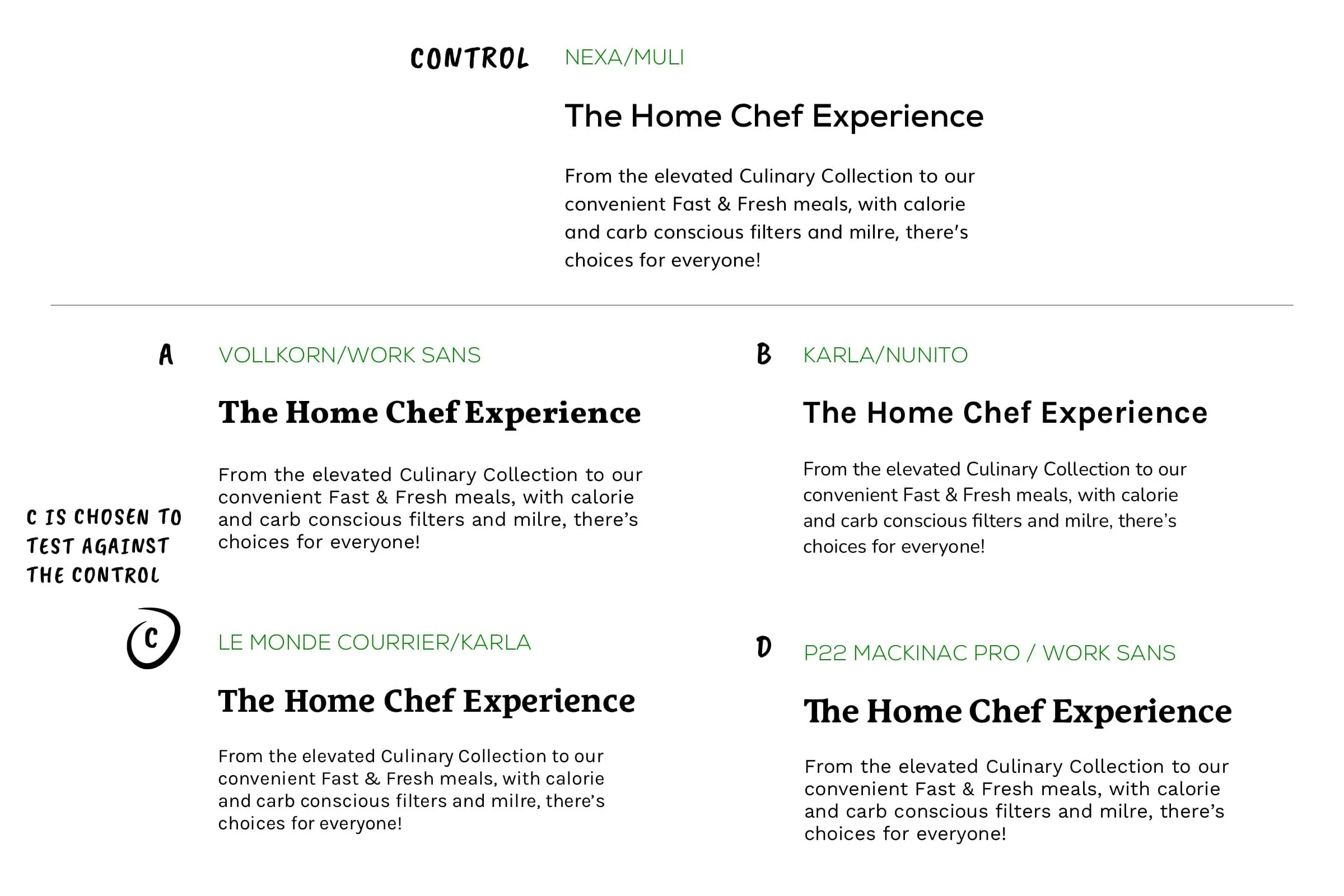
Home Chef’s Brand team decided to pursue concept 2, with tweaks. The team wanted to see iterations of the logo, as well as exploration of typography and iconography.


Consumer testing
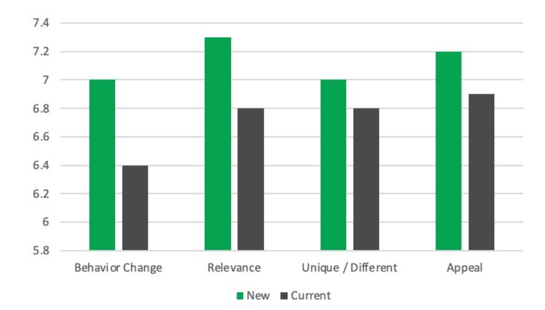
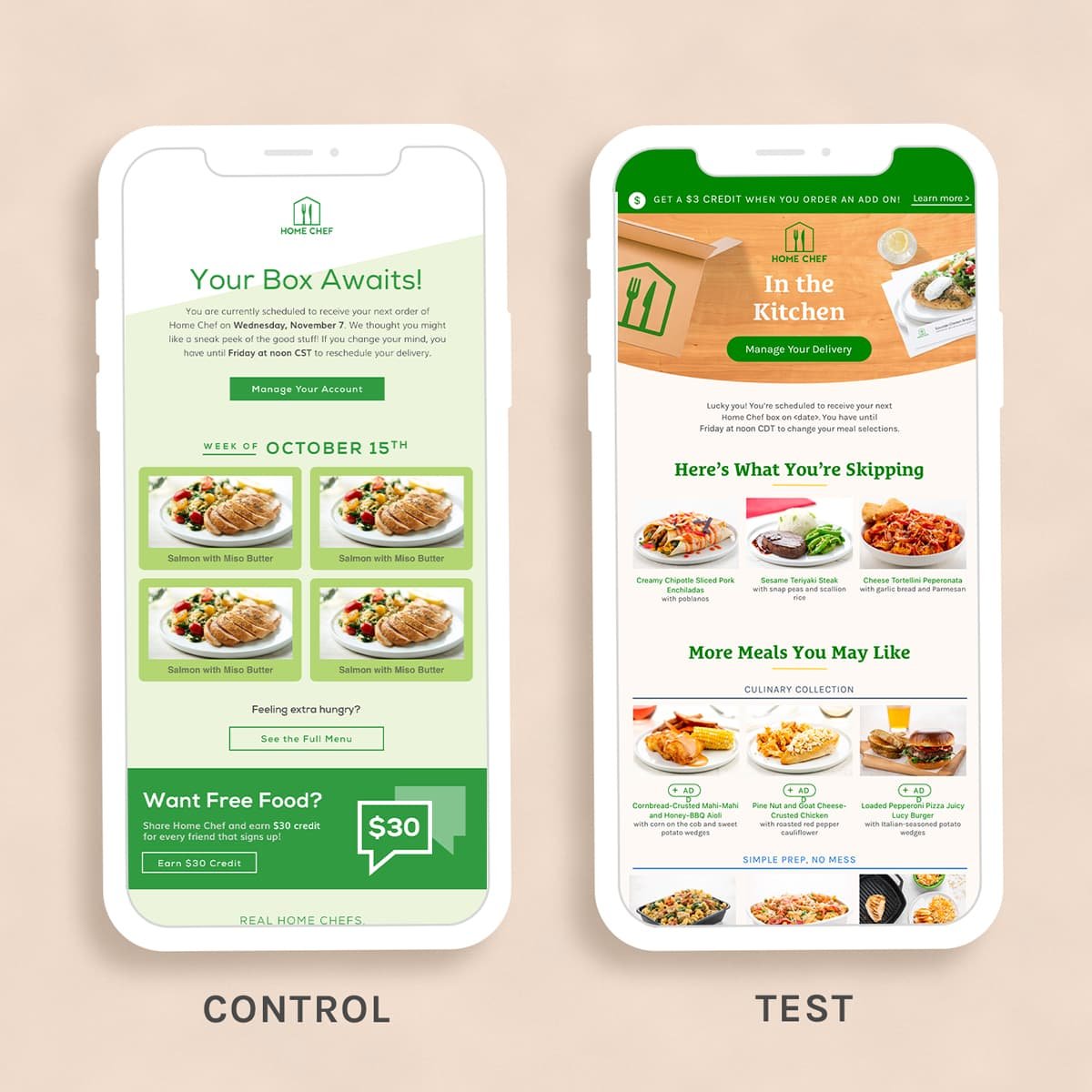
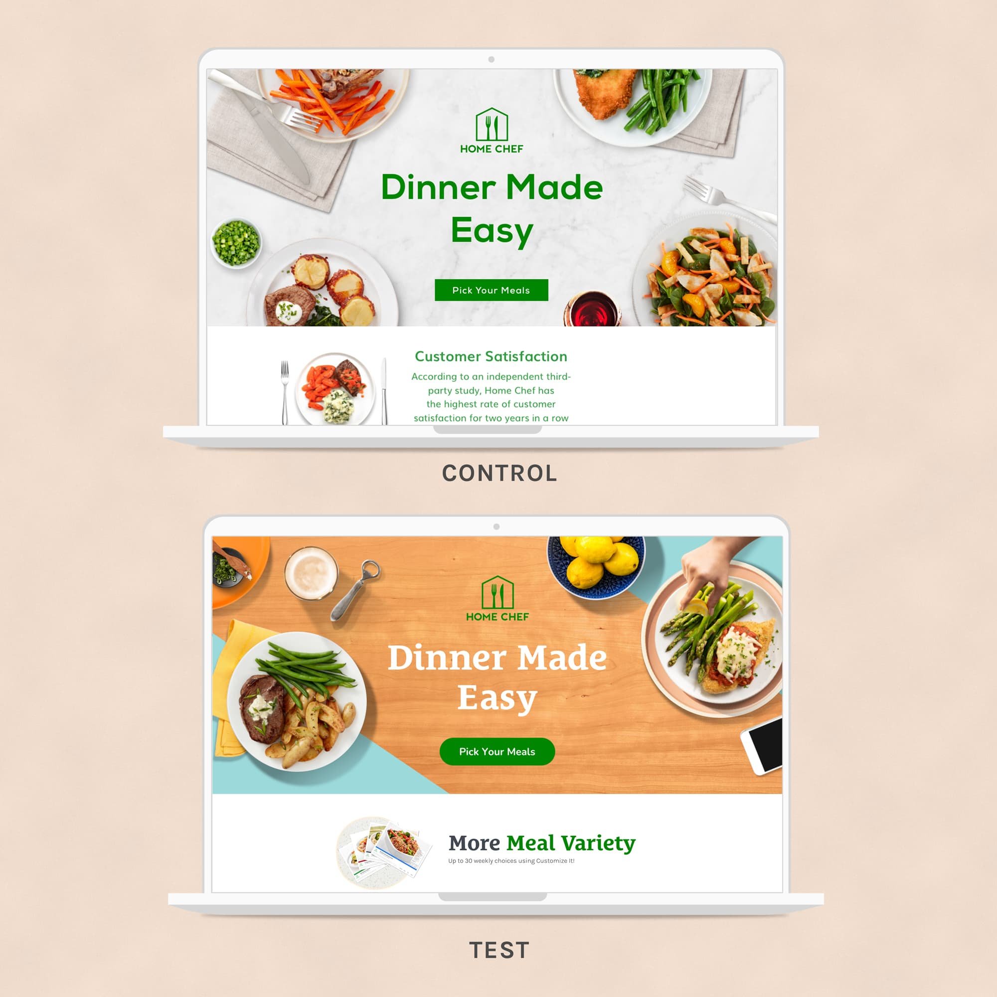
The Brand team enacted A/B tests to gauge consumer appeal. Tests were performed by reskinning existing creative with new brand elements, then pushing them to both controlled group tests. The results favored the refreshed look and feel, though the team decided to proceed with the control logo.

58% of respondents preferred the new look and feel versus current. The new look demonstrated a higher likelihood to drive behavior and change, and was deemed more unique and authentic. Source: Zappi Screen-It Test

Facebook ads

Weekly menu emails

Landing page hero images

Menu photography

Packaging
Implementation
With positive results, the team developed detailed brand guidelines, and launched a slow rollout of the updated brand.


